Tips To Increase Capture Page Conversion
Here are some simple ways to increase your conversion rate on your lead capture and squeeze pages.
Make Your Headline Stand Out
Change the font colour to either Red, Maroon or Black in Bold fonts of
Tahoma, Georgia or Times New Roman, and enclose the headline in
quotation marks "".
"Attention Grabbing Headline!"
Use One Of
These Headline Templates
"How To..." headline. eg. "How to lose weight in 7 days!"
Numbered headlines: "Top Ten Tips To.."
"Who Else Wants To..."
These types of headline have consistently been proven to be the best ones to increase conversions.
Or use the TinyWow - Free AI Writing Tools to generate great title suggestions for your email subjects, blog posts, articles and much more!
Make Your Headline Emotional
Advanced Marketing Institute - Headline Analyzer. This free tool will analyze your headline to determine the Emotional Marketing Value (EMV) score.
As you know, reaching your customers in a deep and emotional way is a key to successful copywriting, and your headline is unquestionably the most important piece of copy you use to reach prospects.
Keep The Opt-In Form Above The Fold
Make sure that the opt-in form is always visible without scrolling down the page.
If you are displaying the page on a traffic site, such as a safelist or viral mailer, take into consideration that the page will be a lot lower down due to the mailer frame.
Keep It Simple And Clean
Keep the layout of the page as simple and clean as possible. Only have relevant text and graphics, such as an eBook cover if you are offering that as a lead magnet.
Make Bullet Points Benefit Rich
Do not just list the features of the product, but enhance it with a benefit as well.
e.g. This Product Does This - And This Is What It Means For You.
Make Videos Autoplay
If you have a video on the page, then it should start as soon as the page loads and ideally be on the left-hand side with the opt-in form on the right.
Make Images Clickable With A Prompt
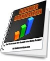
If you have an image of an eBook cover or video still on the page, then make it clickable with a pop-up prompt box.
Click Above Image To Try It!
Code:
| <a href="#" onclick="alert('Hold on there quick clicker! Enter your name and email address in the box for FREE ACCESS to your Banner Maximizer eBook!')"><img src="../images/eBook-Covers/BannerMaximizer_Small.jpg"></a> |
If someone is willing to take action to click the image, then it is more likely they will fill out your form to complete the process.
Make Video Stills Look Like Actual Videos
If you are getting someone to sign-up to watch a video, then include a still image with a play button on it, or better still create a small animated Gif from the actual video. You can also use the code from the above tip to further encourage them to sign-up.


Hint: Using an animated Gif in an email, if it links to a video is proven to get a much better click-through than a standard still image.
Please read the article Increase Your Email CTR With Videos, which shows you how to create animated GIF videos.
Clear Call To Action On Your Form Button
Do not just write "Subscribe" or "Submit" on your form button, and try to write it in the first person.
e.g. "Send Me My FREE eBook", "Download My FREE Gift"
Make The Form Stick Out
Make the subscribe form noticeable.
You can put a coloured border round it.
Make the background colour of the form contrasting with the rest of the page.
Add arrows directing the person to the contact form.
Ask For Minimum Information
Try to have as few form fields as you can.
Ideally just ask for the email address. The more information you ask for adds to the friction of the person to actually sign-up.
Split-Test EVERYTHING!
Try implementing the tips above and split-test everything you do.
Try one change at a time to your original capture page and use a tracking tool such as The Real Tracker to split-test the original page against the new one. If the new one works better then keep that and try another small change, until you get your best opt-in rate possible.
Making small changes to the page such as, button colour, background colour etc. can make significant improvements to your opt-in rate. But unless you test and track everything, you will never know what works, and what doesn't!
I hope you found these quick tips useful.
If I find any more then I will add them to this page.
All the best,
Martin Chantler.
P.S If you need anything explained in more detail, then feel free to contact me. Details in footer and header of each page!
Remember, I am always here to help you!


